 How often do you see a business’ website and their promotional material and notice that the colors used aren’t exactly the same? Or when you go to a presentation booth and notice that the colors on their fliers aren’t a perfect match? This happens when the company does not have sufficient understanding about how to use colors in different mediums, and they are obviously struggling to create a true brand image.
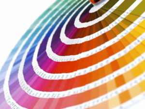
To be successful at branding, you have to be consistent This means you should create a brand identity guide, in which full clarity exists on how your logo should be used, what kind of fonts you want to employ and what your corporate colors are going to be. When you discuss colors here, don’t think about red or yellow, but rather start by knowing your Pantone color. Additionally, you need to think about RGB and CMYK colors. Grasping this will explain exactly which colors you should use and when, to create a consistent and unified brand image.
RGB
RGB stands for Red, Green and Blue. This process is only used in digital design, as it is in this type of work that these three colors are used solely. Indeed, they are the colors we see on our mobile devices, computer screens and television sets. Of course, mixing the three colors together in different ways creates a range of hues.
“RGB has no actual canvas to be placed upon-it is projected against a screen using light. The use of all three colors together at higher intensities results in white and lighter tones, while black is produced with less light against the darkened screen.”
One of the big differences between RGB and PMS or CMYK is that the absence of color with RGB results in black. With the other two, the absence of color results in white.
CMYK
CMYK stands for Cyan, Magenta, Yellow and Key, which is black. This is generally one of the more popular options for printing, as it allows for the widest range of colors, hues, shades on the overall color palette.
“CMY(K) colors work by “subtracting” or absorbing light reflected from a white piece of paper. With no ink or toner on the page, 100% of the light is reflected back to the eye and the paper appears white. By adding 100% density of each C, M, Y, (ink, toner) to a sheet, they absorb all the (white) light and we perceive the color as black (the absence of all color).”
PMS
Finally, there is PMS, which is still used as the reference point for all other print options as well. PMS, or pantone colors, are used to describe special mixtures of ink colors. What matters with these is that they have to be totally perfect in their match. Indeed, companies that use PMS colors have to be licensed for this and they get checked to make sure the colors still match perfectly. The only real issue with PMS is that it uses opaque ink.
“Since PMS colors are intended to stand alone, the inks are opaque. This creates problems when designers attempt to use transparencies with PMS colors. If you want to use transparency effects with a PMS color, you must use the CMYK equivalent of the color rather than the actual PMS color.”
Luckily, this is possible and easy to achieve, so long as you know your PMS color notation (remember how we said it isn’t just about red or yellow?). Each PMS color can be recreated using CMYK, but what may seem like a minute difference in shade can actually be huge if you print it on a large item. This is why it is so important to have that strategic document in place in terms of corporate branding.